Monday 29 April 2013

PDP: Look-Select-Deepen

Today we had a session studying some textile samples. We had a list of questions that we had to answer simply by observing the samples.

What do you see?
Is the piece textured?
Do you like it and why?
How does it make you feel?
Why does it make you feel this way?
Does it have a meaning? What?
Do you think the piece has a title?
Is colour used? How? Why? Is it effective?
Does it contain pattern, shape and form?
Is their a narrative?
Does it evoke a story/memories?
What techniques, processes and materials have been used?

After we had answered these questions we then were allowed to reassess whilst able to touch the samples.

The whole purpose of the exercise was to encourage us to;

Look
Select/See
Deepen

This is a way of me improving my writing skills both in relation to my own work and when researching others. I will use these questions as a template for future reference. They prompt me to write what I am actually thinking. My tutor also pointed out that it may be helpful to use a poem or a quote that reminds me of the work when I'm not in front of it.

Sunday 28 April 2013

Matthew Williamson


Matthew Williamson uses vibrant colours in his work with very precise bead and stud detailing.  As well as print, embellishment details are used as patterns.  Williamson has an amazing way of flattering the female form.
Interior of shop with customised walls!


Partially dyed netting- I experimented with this too as an overlay


                                 Hand-rolled sequins for dress detailing inspired by coral.


Philip Treacy

Inspiring Gothic influenced head pieces and masks modelled on Stephen Jones muse Isabella Blow.  The black intricate detailing of these pieces creates a dramatic mood.


Elsa Peretti in Helmun Newton's Photo 1975...the inspiration for the lace mask below


                                     Fantasy castle headpiece....eccentric and fairytale like

McQueen


Sarah Burton


In 2000, Burton was made Head of Design – Women’s wear. On May 2010, Burton was announced as Creative Director of the Alexander McQueen brand and has worked alongside Lee McQueen for more than 14 years. 

Since her appointment, Burton has produced acclaimed collections with a focus on handcraft, establishing herself as an accomplished designer with artisan and technical excellence which is what I admire.


Butterfly details from the 2011 Collection
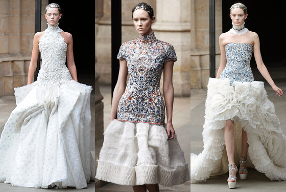


Mosaic effect bodices with pin-tucks/ ruffles and pleats to the skirt part


Thousands of feathers and couched metal work adorn this beautiful gown

 
Burton was recipient of the Designer of the Year award at the British Fashion Awards in November 2011. After an 11 year absence from London, Burton presented the AW12 collection of McQ, a higher-end contemporary line from the house at London Fashion Week in February 2012.

.
 

McQueen Himself

Alexander McQueen was born in London on March 17th 1969, the youngest of six children. He left school at the age of 16 and was offered an apprenticeship at the traditional Savile Row tailors Anderson and Shephard and then at neighbouring Gieves and Hawkes, both masters in the technical construction of clothing.
 
From there he moved to the theatrical costumiers Angels and Bermans where he mastered 6 methods of pattern cutting from the melodramatic 16th Century to the razor sharp tailoring which has become a McQueen signature.

Aged 20 he was employed by the designer Koji Tatsuno, who also had his roots in British tailoring. A year later McQueen travelled to Milan where he was employed as Romeo Gigli's design assistant. On his return to London, he completed a Masters degree in Fashion Design at Central Saint Martin's. He showed his MA collection in 1992, which was famously bought in its entirety by Isabella Blow.

Alexander McQueen shows are known for their emotional power and raw energy, as well as the romantic but determinedly contemporary nature of the collections. Integral to the McQueen culture is the juxtaposition between contrasting elements: fragility and strength, tradition and modernity, fluidity and severity. An openly emotional and even passionate viewpoint is realised with a profound respect and influence for the arts and crafts tradition. Alexander's collections combine an in-depth working knowledge of bespoke British tailoring, the fine workmanship of the French Haute Couture atelier and the impeccable finish of Italian manufacturing.

In less than 10 years McQueen became one of the most respected fashion designers in the world. In October 1996 he was appointed Chief Designer at the French Haute Couture House Givenchy where he worked until March of 2001.


Beaded Corset, again about silhouette and fine details...


 Beautifully fragile and decayed. Melancholy yet romantic...


Curvy padded hips to create the ultimate womens silhouette.


Shells used as embellishment


2003 - Irere
WOMEN'S SPRING/SUMMER 2003 "IRERE"
 

Friday 19 April 2013

Tutorial: How I want to develop

I've decided to continue developing the embroidery aspect of my work. This is the bit that is most inspiring and enjoyable for me at the minute and I want to improve my skills. Over the next week I want to refine my drawings by looking at certain aspects that work well such as materials, ways of application etc and move them into a more detailed drawing. I think it's also important to keep looking at details of Seal-life such as fish scales and patternation - relating this into my 3D embellishments and embroidery,

I need to develop my embroidery skills perhaps by concentrating on three things that may lend themselves well to my Sea-life theme. Such as Suffolk puffs, stump work etc.

My colour scheme also needs refining. I will do this by exploring balances in colour composition and how this effects the mood.

Monday 15 April 2013

Further Development

I decided that this piece needed some kind of 3D aspect to it, almost like some kind of fish or coral cluster. To do this I cut some of the remainder of my fabric into squares and repeated the embroidery and sequin process. I then tacked around in a circle with a knot in the thread and then pulled the thread to make a puff, stuffing as I went.

Once I had the three forms I then hand sewed them to the other piece and each other.

I am so pleased with the result, it is an encrustation of colours and textures. I would like to experiment further with forms like this and develop into collars an headpieces so that they can be stand alone rather than just embellishment pieces. I would also like to include the liquid latex I have been experimenting with in some way.

I am now going to focus my colour more using one of my favourite drawings to pick threads in that colour. I will also develop prints and hand paint utilising this colour scheme.


Print Development

I started developing my printed fabric into something more textured relating to my drawings. I started by embroidering circles with a freestyle foot using a short zigzag stitch. I used various polyester and silk threads to tie in with the background print.

I also experimented by adding in other pieces of textured fabrics that I had previously dyed with dysperse dye. These fabrics included vintage velvet from the 80's (sourced from my loft!), poly-satin with an ingrained flower print (charity shop fabric bin) and vintage lace and curtain netting also sourced from charity shops. These were all sourced for their interesting textures.

I then used a soldering iron to burn various areas of my polyester base fabric away creating a lace like cut out feel. Afterwards I decided to add clusters of pearl beading and sequins.


Wednesday 10 April 2013

Printing Day

Spent some of today in the workshops printing on the sublimation printer.

Materials: Polyester sourced from charity shops including curtain netting.

What worked: the mixture of polyester and some sort of coating on the netting created softer colours which was what I was wanting to achieve. Hand painted dysperse creates better tones for the colours I'm trying to achieve.

What didn't work: the colours weren't what I wanted. Some of them were too acid or murky so I experimented with dysperse dyes from the pot with water enabled the colours to become pastel tones.

As much as I like the literal representations such as fish and teapots, I don't think this ties in with the sculptural, textured feel I want to create in this project. I'm thinking literal representations can be reserved for the embellishments or kept very simple such as a half drop repeat with a simple background. This way it won't be too much with an embellishment. The other direction I'm also thinking of going is sticking with textured prints rather than conversational so that the embellishment flows with the fabric.

Development:

Stitch and bead onto seahorse and shells.

Experiment with burning patterns into the large prints.

Experiment with foils.

Consider placement on shirts.


Work Placement continued...

This week I have been dealing with the Star Wars exhibition. Sitting in whilst people look round, talking to the public. Whilst doing that I have been continuing work on the favours for the Surrealist Soirée. Finger knitting with wire has been fun, results below!


Monday 8 April 2013

Inspiration Boards

Collected images from my Pinterest boards that have initially inspired me within this project. Mermaids, textures, sea-life, encrustations and adornment...words that create ideas for me.


Monday 1 April 2013

The Blue Planet

Watching this for inspiration. Loving the intense colours and textures of the magical land under the sea...