Tuesday 19 November 2013

Houghton Hall; Revisited


I visited Houghton Hall at the weekend to see the 'Revisited' exhibition- the Walpole masterpieces from Catherine the Great's Hermitage. I knew that I would gain more inspiration from the house than the paintings.  It was gloriously ornate.


This giant shell above the bedhead in the green velvet chamber was my favourite thing in the whole house.  I love the oversized scale and shape. To fit the embroidery around the wood carving must have taken hours of work.  It inspired me and I can imagine making a decorative, quilted shell as a head piece for a photo shoot or a quirky accessory. 

 
The feet of the chairs were claws and the arms were formed of carved eagle heads. Reminded me of something from a fairy tale castle.
 
The walkway leading to the west wing of the house is pictured below. Everything was designed to be symmetrical and to appear long. This is to show how much land and therefore how much money the owners had. It looks to me like you are being pulled into a fantasy.

Art Nouveau; Alphonse Mucha


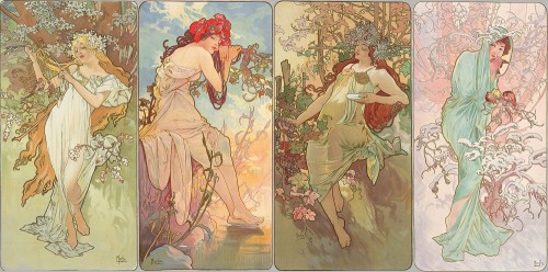
With it's flowing lines and organic shapes inspired by flowers and natural forms, Art Nouveau (1890-1910) is a big inspiration within my work.  It depicts movement and magic and harmony with surroundings.

According to the philosophy of the style, art should be a way of life. For many Europeans, it was possible to live in an art nouveau-inspired house with art nouveau furniture, silverware, crockery, jewellery, cigarette cases, etc. Artists desired to combine the fine arts and applied arts, even for utilitarian objects.  Art nouveau and it's decorative style was utilised within the fairgrounds very ornate fronts.

Alphonse Mucha


Four vertical panels side by side - see individual works for descriptions
The Seasons 1896


I love the colours that Mucha uses in his work, time after time I am drawn to girly muted pastels. I also like the fact that Mucha uses outlines within his work yet they don't appear harsh because they are also muted mocha or greys. I also like his choices of theme, for example, the months, the times of day, the seasons. All themes that conjure up numerous ideas for imagery and colour palette.


Salon des Cent 20th Exhibition (1896)


Similar  colours used within my own sampling

The Victorian Fairground and Menageries


A menagerie is a form of keeping common and exotic animals in captivity that preceded the modern zoo. The term was first used in seventeenth century France in reference to the management of household or domestic stock. Later, it came to be used primarily in reference to aristocratic or royal animal collections. The French-language "Methodical Encyclopaedia" of 1782 defines a menagerie as an "establishment of luxury and curiosity." Later on, the term referred also to travelling animal collections that exhibited wild animals at fairs across Europe and the Americas.

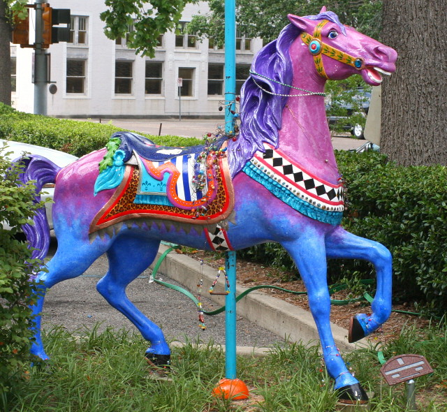
In the Victorian period there was a boom in fairground attractions and menageries. Boxing shows, 'Freak shows', ghost trains and carousels were all part of the magic of the olden day fairground. This occurred at the same time as an increasing interest in the visual arts. The rides, art work and displays of the fair grounds became very ornate as photographed below. 

Photo: show.


Photo: show

Tulle and Candyfloss....the relationship to my own work and context

Since I discovered Karen Casper's work last year, I have been captivated by her multimedia creations.

Her inspirations run alongside mine including vintage embellishments, the mythical and sea-coral.  She uses a variety of techniques such as Devore, fabric painting, stitching and her trademark three dimensional embroidery with glow in the dark thread. I think the layered aspect to her lace makes the work so much more captivating, it demands a second and third look.

Karen's market seems to be for bespoke one-off creations which means she can afford to spend both time and money on precious materials and the customer can ensure no one will ever have the same.

Her creations are normally an accessory to the body which can be viewed not only as fashion for editorials but also as exhibition pieces.  I also think costume definitely has a strong influence over her work and sculptural embroideries.  Her latest creations....


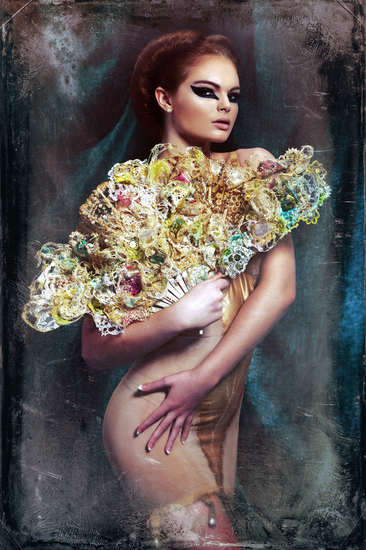
Ventalina - 3D embroidered fan

The piece is insipred by the growth and cultivation of the undewater world named after Gorgonia ventalina, the purple sea fan, which is an especially beautiful and delicate coral whose latticework of branches is reminiscent of lace. I used a 19th Century French lace fan as the base and applied 3D glow in the dark embroidery that includes vintage lace. Other techniques used within the piece include devore, digital print and other fabric manipulations. Finally embellished with vintage pearls and jewels.   The work is part of the Manchester Museum's Coral: Something Rich and Strange Exhibition


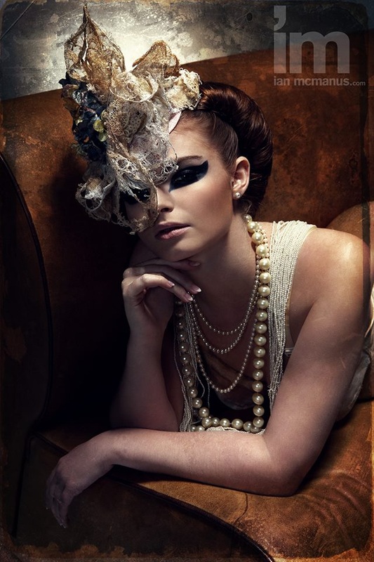
Violet - 3D embroidered headpiece

I  created the contemporary headpiece using pieces of Gawthorpe's antique lace,combined with glow in the dark thread to produce a 3D embroidered sculpture. I also chose two headpieces  from their collection to gain inspiration from. A steamed fur felt skullcap style hat from 1930-40. Trimmed with leaf shapes of the same fabric and a section of gold chain and a ladies bonnet from 1860-1890. It has a plaited straw triple brim lined and trimmed with velvet and is decorated with artificial lily of the valley and orange blossom flowers and flowers made from swans down. 


I love the combination of neutral colours and the odd dashes of bright.  I can very much identify with Karen Casper's context for her work. The aim of my work is also all about the accessory whether that be to decorate the body, an interior of a house or paper decoration.  I feel inspired to create a super decorative parasol, a mask and I want to bring together my love of millinery with my own prints and embroideries.

I also have wanted to do a photo shoot for my work for a long while.  I have ideas as for how I would stage this. In particular, my current work would look fabulous on models riding on a carousel.

http://www.tulleandcandyfloss.co.uk/violet-and-ventalina.html


Gustav Klimt and Decoration in my own work

Water Snakes II- 1907
I believe my work has been subconsciously influenced by the symbolist style of Gustav Klimt.  I was always interested in the decorative aspects of his paintings and the rich colours he used with highlights of metallic.  Klimt would use shapes such as circles to represent femininity or squares if the subject matter was masculine. These shapes would then build up to create decorative layers within the painting.
The Kiss- 1907
 

When looking at my own work it is clear I love to decorate. From my drawings where I use metallic ink and glitter through to my samples with sequins and French knots.  I seem to be drawn to using circular details within my own work which is perhaps a subconscious echoing of the femininity of my work.


Tuesday 5 November 2013

Dentzel and Carousel History


During the early 1800's the Dentzel Carousel Company, not yet so named, began as a winter occupation at Michael Dentzel's southern German wagonmaking shop. He sent his son Gustav with a full sized carousel on a sailing steamer to America in the 1850's. In Philedelphia PA Gustav established a cabinetmaking and carouselmaking business, the carousel business flourished. Many immigrating European fine woodworkers were hired by the Dentzel company. Gustav's two sons, William and Edward, continued the business building large elegant galloping carousels for many locations in the USA. Edward relocated to southern California in the 1920's to set-up and operate carousels. In 1927, with William's death, the company folded, much of it was sold to the Philedalphia Tobaggan Company.


Edward's son William 2nd, born in Santa Monica, became a lawyer and raised a family in the San Fernando Valley. Later in life he too answered the carouselmaker's call to carve animals and make several small carousels. His son William 3rd worked on wooden sailboats and during travels in his  20's and built his first carousel in Chiapas, Mexico at 30. After some more boat work and a wood carving visit to Quebec he moved to Port Townsend WA where he and his wife Penny raised three children. Upon William 2nd's death in 1991, William 3rd took on the joyful challenge and task of fitting the Dentzel Carousel Company into the age of computers. Simple 10 rider wooden carousels with hand-crank, foot-pedal and electric powered mechanisms have become the style chosen to carry the craft into the 21st century.

The name CAROUSEL comes from the Italian CAROSELLO or "little war", a game brought back from the crusades involving clay balls of scented water thrown between galloping horsemen in a ring.

In the sixteenth century the French called the game carrousel and turned it into a magnificent spectacle of fancy dress and horsemanship.
Keep in mind that the best carousels were found in America, not Europe. The immigrant craftsmen wanted to make sure that their work reflected their dreams of what coming to America meant. The true American spirit was seen in the unique and free-flowing styles of the horses created in America. The brass rings that were on the horses on the older carousels were present so that people could try to grab in order to get a free ride. Today the brass rings are mostly gone. Riders are treated to this fun in a few places. Usually the most decorative are the horses that face the public. This is referred to as the "˜romance side'. The horse that is on the outside directly behind the chariot is referred to as the "˜lead (King) horse'. These are considered the fanciest on the ride. The benches for people who do not want to hold the reins are called lover's seats. These are also referred to as "˜chariots (gondolas)'.


The menagerie carousels by Dentzel contained animals both mythical and unexpected such as camels, zebra and the less exotic pig!


Horses on the carousel were excessively decorative with carved wooden flowers, golden detailing and bright painted patterns.


Dekuntsboer


I came across this brand whilst shopping in Brambles, Norwich. They cover gift, home wear, fashion and accessories. I am inspired by the bright vintage imagery combined with pepped up photo images of animals with photo-shopped hats on....funny and beautiful.  The colours and the quirky imagery completely strike a cord within my own work, particularly my digital creations.

Development, context and relationships....and an Indian wedding!

I originally did this Swan painting onto vintage wallpaper with raised textures. I always seem to choose a texture to work into because it makes it far less daunting than to work onto a flat white surface.  I have also been working into rolls of canvas a lot and this is something I want to continue to develop.

I am inspired by the work of Rob Ryan and traditional paper cutting so I thought I would experiment with my love of layering and multimedia through the use of cutting paper away.  I have used vintage imagery collected from vintage shops along with old book pages to create a peep-through aspect. It also adds a different dimension when you look at image and spot something new each time.  I enjoyed the cutting out of the original textures found on the paper and incorporating them with the overall image.


I was thinking a lot about context when creating this piece. I really like it just as a piece of art. I feel it would be beautiful as a super sized wall mural. I also want to develop the swan theme, I could imagine using a two swans as bespoke wings or a mask/ collar/ head dress. I can see a strong relationship developing between my drawings and my sampling. Literal thing such as the black dots and gold dots relate to circular stitches and sequins and beads.

I went to and Indian wedding in the summer and was memorised by the details of the saris alongside the encrusted embroidery. I think this has really influenced by drawing style of late. I like to make my imagery up of tiny dots and metallic that shimmer. I can also see that the bright colours of the saris tie very much in with my own work...


Monday 4 November 2013

Her Curious Nature


Her Curious Nature
 
I discovered Her Curious Nature whilst shopping in Topshop.
 
Her Curious Nature (HCN) stands out as the brand showcases an array of designs that bridge the gap between traditional millinery and current fashion trends, this creates the brand’s popularity with those from all backgrounds and ages.

Much like her designs, Her Curious Nature founder, Sabrina, has never been one to adopt a conventional stance. Despite always proving to be creatively driven she never went on to receive any formal training in design. In Sabrina’s work you can see her fascination with the traditions of eastern performing arts, this transpires through her work frequently, as the use of rich colours and luxurious embellishments echo the exotic detail of traditional Arabic costume. And yet in such contrast the elements of British country heritage fabrics and past times incorporate her childhood influences and current inspirations as a UK designer.

The head–dresses are each individually handcrafted, using hand dyed velvet flowers. Each piece unique in its arrangement and all embellished using coloured glass crystal jewels. Vibrant tropical colours such as Orange and Fuchsia or Acid Green with Red were enhanced by oversized Lilies in bright white for a punchier tropical feel.

I love the clear costume aspect these pieces have, suitable for editorials and the person looking for something alternative to the norm in terms of accessories. Magical....


Sampling

I felt it would be interesting to develop my sampling in a non-digital way to see which I preferred, so I began by creating a collar shape out of plain cotton and painting a horse character with inks. I then quilted the horse using special machine quilting needles and black cotton thread.

I need to work on this further with embellishments and non-flat colour. I do like the use of stitched words to echo the narrative of the piece. In this case 'round and round we go'.

I think to explore the non-digital ways of creating a character/ accessory piece I could sublimation print various textures such as laces etc onto fabrics as well as actually quilting and embroidering to create layers.  Within my drawings I use small dots to build shape and texture but I could replace this in a non digital sample with small circles of machine stitch, beading and sequins or French knots.

Coral and Tusk

I found this company when perusing Homes and Antiques. I love the way animals are brought to life along with other aspects of nature inspired by overseas travel and adventure.

The drawings are initially sketched and then transformed into stitched items using the CAD embroiderer and stuffing. Quirky and interactive (actual pockets) characters.


Thursday 24 October 2013

Mrs Lily; Sampling, context and development

I made Mrs Lily as a direct result of my second tutorial with Louise Richardson. I have had some of my drawings printed on the sublimation printer and wanted to pad them and bring them 'to life' with embellishments, hand and machine embroidery. I bought a variety of needles for my Janome Harmony 2041 including thin needles for polyesters and synthetics (sublimation materials), quilting needles and metallic thread embroidery needles.

To create Mrs Lily I used polyester sourced from an old shirt in a charity shop and backed it onto a piece of cotton found fabric. I love the idea of utilising unwanted materials. I then highlighted my drawing with a straight black stitch. I did struggle to actually quilt the bird because I need to reach a compromise between using freehand and a structured stitch with a normal foot/ quilting foot.

I left loose threads on my embellishments because of the trend research on WGSN 'Archaic Threads'. I think it added charm to Mrs Lily. I also experimented with embroidery silks (2 strand and 4 strand) to create varying sizes of French knotting building up textures in different colours. This creates a more textured base to then embellish, representing a hint of the animals genuine appearance (wings). My sequins are sourced from www.josyrose.com because the sequins seem so much stronger and symmetrical than others I have used. I would like to try and source some sort of vintage beading to use in partnership with the sequins in the future.


I love that drawing onto a magazine page means that there is this little face peeking through although I would have to be careful with doing this with illustrations because obviously that little face is someone else's work.

I still really want to take this peeping idea forwards using vintage imagery from photographs I sourced over the summer.

Context

I'm finding myself getting really excited about the work I am producing. I can imagine this bird a bit flatter as part of a collar as a shoulder on a dress. Swans on the side of shoes, embroidered animals wrapped round necks and lamps and cushions ahhhhhhhh the possibilities of accessories!!! I also think my drawings have the potential to be developed into transfers for ceramics, simple wallpaper repeats and quirky giftwear/ stationary/ fine art dolls and childrenswear. Why pen myself in to fashion or interiors or art when I can and want to do all three?

Drawing Workshop

Today we did a group drawing session which involved trying to work differently to how you normally would or developing your individual style(which I think I have finally found!)

I started by drawing a fairground horse on canvas trying to work in a larger scale than I would normally. I found that the boundaries of the canvas are to rigid so I am going to try and develop extensions of my drawings off of the 'paper'. 

Today Grainne said that I can afford for my work to be gestural and a bit crazy with colour and movement. I can see that my work is almost an extension of my personality, my loves and my personal style.  This is interesting to consider within the context of my research report where I am looking at makers who use their work as an extension of themselves. I definitely fit into this sort of making category. I find it hard to hold back with colour and detail and I don't think this is something I should try and do anymore, I just need to go with what my hands do!

I really enjoy using bleach within my work because it's a good cure to soften my colours when I sometimes get carried away. It is a wonderful way of illuminating areas of an illustration and therefore creating an ethereal, magical quality. 

The bleach sometimes burns through papers and rather than panicking I found that it was best to go with what the material was doing, so if it wanted to rip and curl I incorporated this into the imagery. This texture adds to the collage/layered feel of my work. I find that this then directly relates to the freehand machine stitch and almost sculptural sort of embellishment within my sampling.


Life Drawing

I felt that the life drawing session today wasn't massively interesting to me. Rather than continuing to draw lots of quick line drawings I worked over two drawings adding detail and pattern in trying to encourage my developing style of building up layers using textures and patterns within an outline to create definition. Mark making lessons from year one have come in very useful and I have tried to maintain the importance of creating marks within drawings to show movement.